Hi Everyone,
We’ve just launched our mobile redesign! A couple of months ago, we went live with our web redesign – you can read about it in our last blog post. This time around we’ll be diving into what’s changed with our mobile app, as well as our motivations.
Similar to the web redesign, this redesign primarily targets the end-to-end generate experience, from writing prompts and selecting generation settings to viewing your creations. We wanted to ensure you all were receiving a better, more intuitive generation experience for our users while maintaining all existing features and functionality.
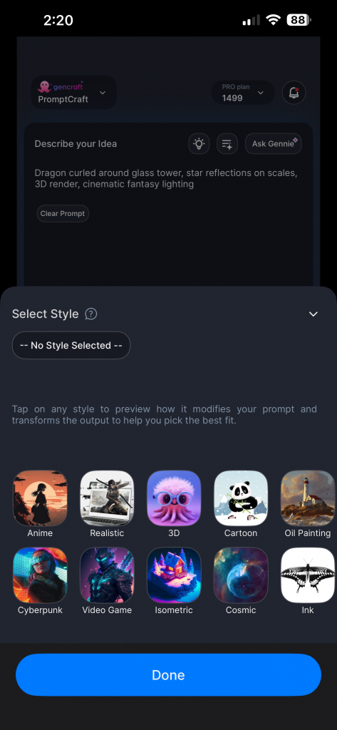
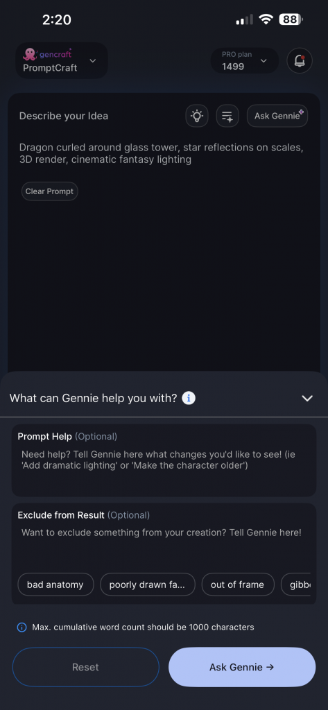
The new generate screen presents a simplified UI that emphasizes the prompt input, which is the most important element for creation. Optional inputs, like reference images, are hidden unless required for the selected feature. We want users to be able to generate quickly without extraneous UI elements.
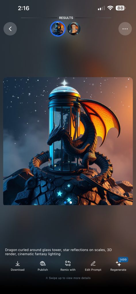
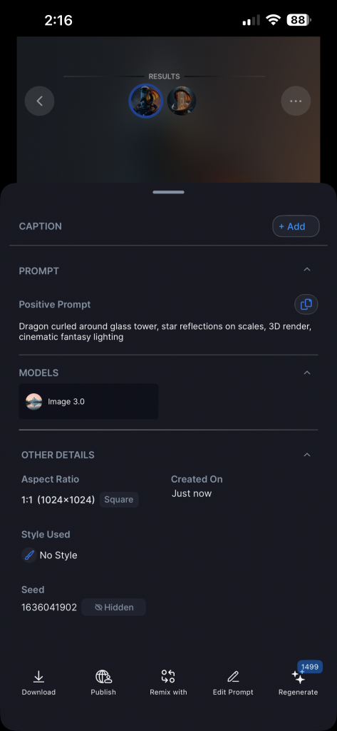
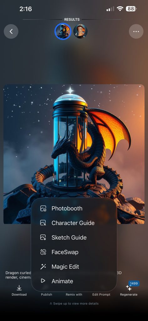
The new creation results screen brings more focus to the actual creation, which is now larger and more prominent. Swipe left and right to navigate between both creations, and swipe up to view the full details for the creations. Key actions like remixing, publishing and downloading are still one tap away, but are now consistently organized in the UI.
Overall, the new redesign will help Gencraft feel more modern and intuitive to new and old users alike. Please give the redesign a try and let us know any feedback!
Thanks for reading, and keep on creating!
Happy New Year,
The Gencraft Team